Making Sense of Financial Inclusion Data Sources
If you are familiar with the concept of financial inclusion, you are also probably aware that there are a variety of data sources available for measuring access to and usage and quality of formal financial services. While having ample data to measure progress is an asset, each of these treats data in different ways, which can lead to confusing results. Depending on what data source you use, you can arrive at drastically different conclusions about financial inclusion.
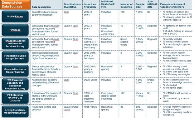
Take data from Uganda, for example. In 2013, the Uganda FinScope demand-side survey revealed that 54% of adults have access to formal financial services, while in the same year the Financial Inclusion Insight (FII) survey said that 12% of people own a bank account. These surveys were released two years after the first round of the Global Findex had found that 20% of adults in Uganda have an account at a formal financial institution. Digging into the definitions reveals the reason for the differences. Uganda’s FinScope indicator is comprised of adults age over 16 years of age who have an account at formal banks regulated by the Central Bank or non-bank formal financial institutions including Savings and Credit Cooperative Organizations (SACCOs), whereas the Global Findex indicator includes adults over 15 years of age with an account at a bank, credit union, another financial institution, or the post office – not including SACCOs. The FIIs definition includes adults over 15 years of age who report holding any type of personal bank account, without institutional specification. Even multiple indicators within the same survey can seem similar, but have different meanings and results: for example, the FII in Uganda measured 12% of people owning a bank account, but 14% of people having access to a bank account, which includes ownership as well as access through a family member or friend.
Definitions are not the only driver of differences among indicators. Indicators are further nuanced by the survey attributes and methodologies. For example, the Global Findex indicators’ lowest level of representation is at the national level whereas the FinScope and FinAccess undertake representative sampling at regional and/or district levels of a country. Unlike the surveys already mentioned, the Financial Inclusion Tracker Surveys (FITS) is conducted at the household level, not individual level, meaning that the indicators represent collective behavior and usage patterns for all members of a household. It is also a panel survey which tracks the same set of households over time.
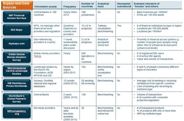
On the supply-side, the 2012 IMF Financial Access Survey (FAS) revealed that in Kenya there are 4.18 ATMs per 1,000km2, while fspmaps.com reported in 2013 that 76.7% of the population lives within 5km of a financial access point. Both indicators attempt to capture access, but are constructed based on different scopes. The IMF FAS includes only formal financial institutions, but will be expanded to include mobile money agents in 2015; whereas the fspmaps.com scope already encompasses other access points, one of which are over 48,500 mobile money agents which make up the majority (78%) of all access points they report within Kenya.
Beyond differences in scope, supply-side indicators are also influenced by the survey attributes as shown in the table below. Many of the same considerations for demand-side attributes are applicable on the supply-side such as subnational application.
Aligning data sources with use cases
Comparing the attributes of different data sources (starting with those outlined in the tables above) to understand their strengths, limitations, and differences can help guide you to the sources and indicators that are most relevant for your purpose. Better utilization and understanding of what existing data tells can lead to better decision-making, more accurate research judgments, and more precise tracking of progress.
Policy-makers and/or regulators driving decisions at a regional or district level can benefit from knowing which data sources are nationally verses sub-nationally representative, since relying only on national sources can mask regional differences. MIX Maps and fspmaps.com offer the most geographically precise supply-side data to date. On the demand-side, the FinScope and the FII provides regionally representative data while the Global Findex can only provide data at a national level. To benchmark against neighboring countries or regions, policy-makers can choose data sources designed for cross-country comparison such as the Global Findex and the IMF FAS.
Providers looking to expand services can use emerging supply-side analytical tools such as fspmaps.com to find areas within a country with limited financial services offerings, or use mftransparency.org to build graphs comparing prices and product offerings to understand competition. These tools go beyond traditional report formats to provide online platforms to manipulate and visualize data to shows trends or comparisons and allow users to tailor the output to their needs.
Variation in frequency of data collection can have implications for policy-makers, regulators and providers’ ability to rely on certain data sources. Infrequent or one-off data sources do not guarantee that surveys will be able to benchmark at the required intervals or even exist in the future.
Is there a need to consider streamlining indicators or providing further clarity on the use cases and sustainability plans for each of these surveys?
Related Blogs

Setting Up Funders to Advance Inclusive Finance: 5 Recommendations
Development funders play a key role in advancing inclusive finance – they influence the dynamics of financial systems and transform the way they work to serve people living in poverty. Here, we share five actions funders can take to drive change.
Kickstarting CICO Rural Agent Network Innovation: 5 Tips for Funders
Based on pilots in five countries (Colombia, Cote d’Ivoire, India, Indonesia, Morocco and Pakistan), we share early insights on how funders can engage with stakeholders in Cash-in Cash-out (CICO) rural agent networks to kickstart innovation.
Comments
This is a really useful
This is a really useful article, in providing a helpful summary of the Access to Finance indicators that are now available and the different approaches they take. Whilst there was a dearth of such studies a few years ago, now we have some very high quality studies, such as FINSCOPE/MAP. To answer the question posed, I would not push for consolidation, as each study provides different 'shades' of information. Rather, the assumptions underpinning each need to be understood, so that 'apples' in one country are not compared with 'oranges' in another.
Add new comment